If you follow me on
Facebook,
Twitter or
Instagram you might have seen the quick shot I posted of my new business cards earlier this week. A promised, here's a full look at what's changed since
last time.
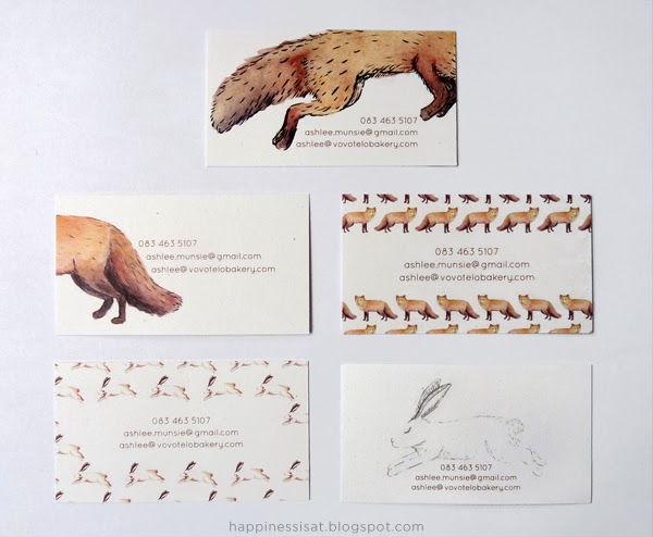
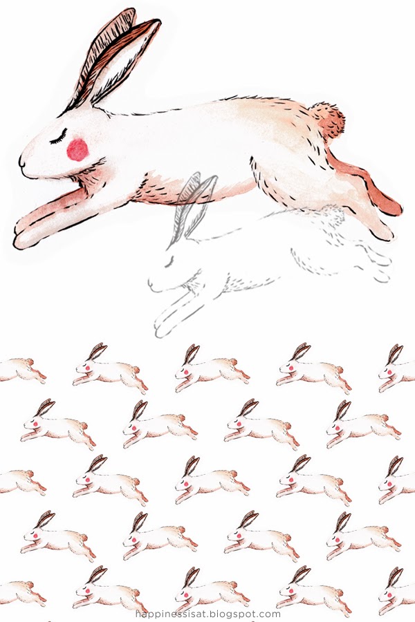
There are 9 different back designs, some the same as last time and some new. As with last time they're all zoomed in areas from my sketchbook, all originally hand drawn or hand painted. I've made them slightly larger now at 60x90mm as opposed to the standard 50x90mm, and I really like how that looks. I think considering there's a mini ‘artwork’ on the back, the increased size suits the content.
On the front, I had this idea of adding in a little doodle block. So my doodles are on the back, and you can add your own doodle on the front! Or just use it to write some quick info, up to you. I thought it was a fun idea so I'm trying it out. I also used a different paper this time that's lightly textured with a kind of natural look to it.
Maybe I'm trying to do too much here on one little business card, but I'd really like it to have more purpose and interest than the usual. Hopefully it also adds more value to it, which is always great! This batch will be numbered since there's just a few of each design and I might do a whole new batch next time... It's kind of an experiment, and I feel oddly excited about it :)
If you didn't see the last batch, you can have a look
here.
I'd love to know your opinions on these ideas, so please do share your thoughts in the comments! :)


